Difference between revisions of "Bootstrap Setup"
PeterRobert (talk | contribs) |
PeterRobert (talk | contribs) |
||
| (27 intermediate revisions by the same user not shown) | |||
| Line 1: | Line 1: | ||
| − | < | + | <div class="btn btn-grey btn-back">{{#fas:arrow-left}} Back</div> <div class="btn btn-grey btn-admin">{{#fas:cog}} Administration</div> |
| − | < | ||
<hr> | <hr> | ||
| − | Phoenix looks great as it is but | + | __TOC__ |
| + | __FORCETOC__ | ||
| + | Phoenix looks great as it is but some Bootstrap settings can be changed to alter the display if desired. | ||
| − | From admin go to '''Configuration → Bootstrap Setup''' | + | From admin go to [[File:adminnavbarconfig.png|link=]] '''Configuration → Bootstrap Setup''' to see this: |
| − | *Click '''Bootstrap | + | <div class="mainpage_box"> |
| − | *Click <span class="btn- | + | [[File:bootstrapsetup.jpg|link=|1500px]] |
| + | </div> | ||
| + | |||
| + | |||
| + | ---- | ||
| + | ==='''Bootstrap Container'''=== | ||
| + | |||
| + | *Click '''Bootstrap Container''' | ||
| + | *Click <span class="btn-yellow">Edit</span> to see this: | ||
<div class="mainpage_box"> | <div class="mainpage_box"> | ||
| − | [[File: | + | [[File:bootstrapsetup2.jpg|link=|1500px]] |
</div> | </div> | ||
| − | |||
| − | + | ==='''Bootstrap Breakpoints'''=== | |
| − | + | CE Phoenix Cart is set with '''container-xl''' as default which displays the page width according to the device screen width. | |
| + | |||
| + | These settings change the behaviour according to the device screen width, described as '''breakpoints''' in the first row, as per this table. | ||
| + | |||
| + | Generally, not specifically, it can be helpful to think of these breakpoints like: | ||
| + | |||
| + | *Extra Small <576px = mobile phones in portrait mode. | ||
| + | *Small ≥576px = mobile phones in landscape mode, larger phones, smaller tablets in portrait mode. | ||
| + | *Medium ≥768px = tablets in portrait mode. | ||
| + | *Large ≥992px = smaller desktops or laptops, tablets in landscape mode. | ||
| + | *Extra Large ≥1200px = desktops or laptops. | ||
| + | *Extra Extra Large ≥1400px = large laptops, large external monitors. | ||
| + | |||
<div class="mainpage_box"> | <div class="mainpage_box"> | ||
| − | [[File: | + | [[File:bootstrapcontainer.jpg|link=|1500px]] |
</div> | </div> | ||
| − | + | ||
| + | |||
| + | ---- | ||
| + | ==='''Bootstrap Content'''=== | ||
| + | |||
| + | *Click '''Bootstrap Content''' | ||
| + | *Click <span class="btn-yellow">Edit</span> to see this: | ||
| + | |||
<div class="mainpage_box"> | <div class="mainpage_box"> | ||
| − | [[File: | + | [[File:bootstrapsetup1.jpg|link=|1500px]] |
</div> | </div> | ||
| − | + | ||
| + | This setting is only used if side Box Modules are installed. They are not installed by default but can be installed, go to '''Modules → Boxes''' | ||
| + | |||
| + | As indicated in the edit options, changing the setting from '''8''' will reduce the width of the page content whilst increasing the width of the side Box Modules. | ||
| + | |||
| + | |||
| + | ---- | ||
| + | ==='''Bootstrap Theme'''=== | ||
| + | |||
| + | *Click '''Bootstrap Theme''' | ||
| + | *Click <span class="btn-yellow">Edit</span> to see this: | ||
| + | |||
<div class="mainpage_box"> | <div class="mainpage_box"> | ||
| − | [[File: | + | [[File:bootstraptheme.jpg|link=|1500px]] |
</div> | </div> | ||
| − | |||
| + | This setting is only used if bootstrap5 template is set in '''Configuration → My Store → Template Selection'''. | ||
| + | |||
| + | This is set to '''auto''' which allows the theme to automatically switch between modes based on the user's system preferences. | ||
| − | + | Set to '''dark''' or '''light''' will fix and the keep the mode unchanged. | |
| + | '''light''' is the default appearance of the store. | ||
| + | |||
| + | '''dark''' would make the store appear like this: | ||
| + | |||
| + | <div class="mainpage_box"> | ||
| + | [[File:dark-mode.jpg|link=|1500px]] | ||
| + | </div> | ||
<hr> | <hr> | ||
| − | {{ | + | {{Forum}} |
| + | {{Pro}} | ||
{{Contribute}} | {{Contribute}} | ||
Latest revision as of 09:31, 2 November 2024
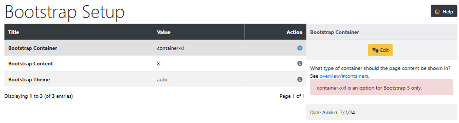
Phoenix looks great as it is but some Bootstrap settings can be changed to alter the display if desired.
From admin go to  Configuration → Bootstrap Setup to see this:
Bootstrap Container
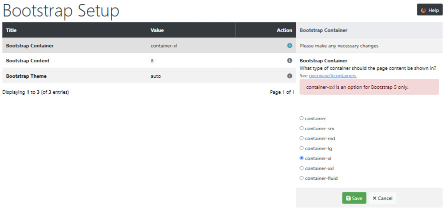
- Click Bootstrap Container
- Click Edit to see this:
Bootstrap Breakpoints
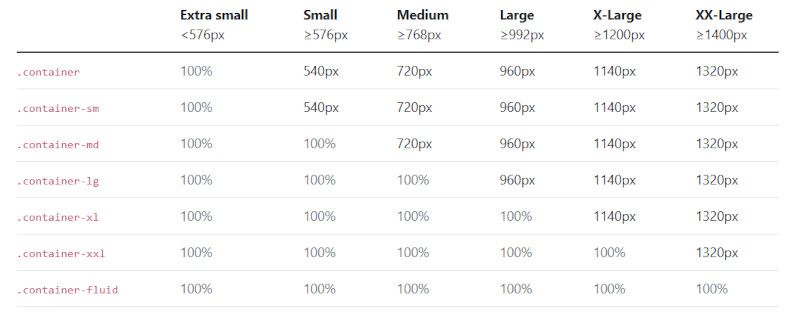
CE Phoenix Cart is set with container-xl as default which displays the page width according to the device screen width.
These settings change the behaviour according to the device screen width, described as breakpoints in the first row, as per this table.
Generally, not specifically, it can be helpful to think of these breakpoints like:
- Extra Small <576px = mobile phones in portrait mode.
- Small ≥576px = mobile phones in landscape mode, larger phones, smaller tablets in portrait mode.
- Medium ≥768px = tablets in portrait mode.
- Large ≥992px = smaller desktops or laptops, tablets in landscape mode.
- Extra Large ≥1200px = desktops or laptops.
- Extra Extra Large ≥1400px = large laptops, large external monitors.
Bootstrap Content
- Click Bootstrap Content
- Click Edit to see this:
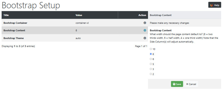
This setting is only used if side Box Modules are installed. They are not installed by default but can be installed, go to Modules → Boxes
As indicated in the edit options, changing the setting from 8 will reduce the width of the page content whilst increasing the width of the side Box Modules.
Bootstrap Theme
- Click Bootstrap Theme
- Click Edit to see this:
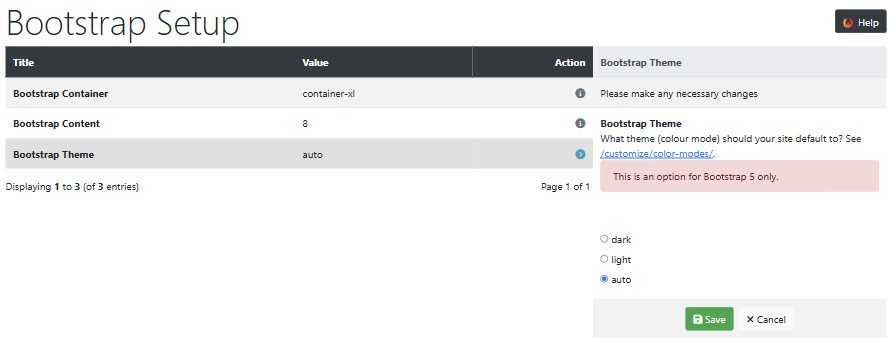
This setting is only used if bootstrap5 template is set in Configuration → My Store → Template Selection.
This is set to auto which allows the theme to automatically switch between modes based on the user's system preferences.
Set to dark or light will fix and the keep the mode unchanged.
light is the default appearance of the store.
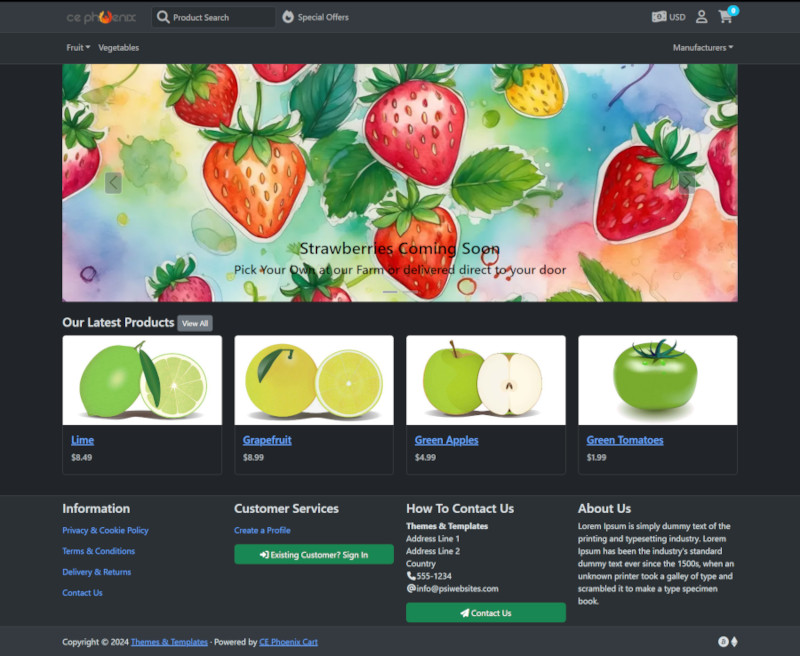
dark would make the store appear like this:
Many Addons and Extensions available in the CE Phoenix Cart Addons Library
If help is needed, support is available in the CE Phoenix Cart Support Forum
Phoenix Cart User Guide, like CE Phoenix Cart, is free to use but is maintained by unpaid volunteers.
All other content is the reserved Intellectual Property and Copyright of phoenixcart.org
