Difference between revisions of "Change Layout"
PeterRobert (talk | contribs) |
PeterRobert (talk | contribs) |
||
| (27 intermediate revisions by the same user not shown) | |||
| Line 1: | Line 1: | ||
| − | < | + | <div class="btn btn-grey btn-back">{{#fas:arrow-left}} Back</div> <div class="btn btn-grey btn-setup-shop">{{#fas:play-square}} [[Set_Up_Store|Set Up Store]]</div> |
| − | < | ||
<hr> | <hr> | ||
| + | __TOC__ | ||
| + | __FORCETOC__ | ||
| + | CE Phoenix Cart looks great as it is but there are many easy ways to change the default layout as desired. | ||
| + | |||
| + | Layout determines how the elements of the website are arranged and displayed on different devices. | ||
| + | |||
| + | <!-- | ||
| + | <big>'''Navigation Bar'''</big> | ||
| + | |||
| + | *From admin go to [[File:adminnavbarmod.png|link=]] '''Modules → Content''' | ||
| + | *Find and click '''Navigation Bar''' in the list to select it. | ||
| + | *Click <span class="btn-yellow">Edit</span> | ||
| + | *Make a note of the default settings so they can be changed back to default if necessary. | ||
| + | *Choose a colour option in '''Background Colour Scheme'''. | ||
| + | *Choose an option for '''Link Colour Scheme''' | ||
| + | *Choose an option for '''Placement''', '''Placement Offset''' and '''Collapse''' | ||
| + | *Click <span class="btn-green">Save</span> | ||
| + | *Have a play with these options and have a look on the webpage to see the results you require. | ||
| + | |||
| − | |||
<hr> | <hr> | ||
| + | |||
<big>'''Box Modules'''</big> | <big>'''Box Modules'''</big> | ||
| − | Box Modules that show in the side columns of the webpage are installed by default. | + | Box Modules that currently show in the side columns of the webpage are installed by default. |
| − | |||
| − | |||
| − | |||
| − | |||
| + | From admin go to [[File:adminnavbarmod.png|link=]] '''Modules → Boxes''' to see this: | ||
| + | <div class="mainpage_box"> | ||
| + | [[File:modulesboxes1.png|link=|1500px]] | ||
| + | </div> | ||
Module Boxes can be set to show on either the left or right column or be disabled or removed so they do not show. | Module Boxes can be set to show on either the left or right column or be disabled or removed so they do not show. | ||
| Line 19: | Line 37: | ||
To change the column where the box displays: | To change the column where the box displays: | ||
| − | *Click <span class="btn- | + | *Click <span class="btn-yellow">Edit</span> |
*Set '''Column Placement''' to either Left Column or Right Column. | *Set '''Column Placement''' to either Left Column or Right Column. | ||
| − | *Click <span class="btn- | + | *Click <span class="btn-green">Save</span> |
To disable: | To disable: | ||
| − | *Click <span class="btn- | + | *Click <span class="btn-yellow">Edit</span> |
*Set '''Enable...Module''' to '''False''' | *Set '''Enable...Module''' to '''False''' | ||
| − | *Click <span class="btn- | + | *Click <span class="btn-green">Save</span> |
To remove: | To remove: | ||
| − | *Click <span class="btn- | + | *Click <span class="btn-yellow">Remove Module</span> |
Alternatively, more Box Modules can be installed. | Alternatively, more Box Modules can be installed. | ||
| − | *Click <span class="btn- | + | *Click <span class="btn-red">Install Module</span> - the number shown next to the button indicates how many more modules are available. |
*Click on a module in the list to select it. | *Click on a module in the list to select it. | ||
| − | *Click <span class="btn- | + | *Click <span class="btn-yellow">Install Module</span> |
| − | *Click <span class="btn- | + | *Click <span class="btn-yellow">Edit</span> |
*Set '''Column Placement''' to either Left Column or Right Column. | *Set '''Column Placement''' to either Left Column or Right Column. | ||
| − | *Enter a | + | *Enter a '''Sort Order''' value to sort the boxes displayed. Do not leave '''0''' as the '''Sort Order''' on modules as it can cause problems. |
| + | |||
| + | |||
<hr> | <hr> | ||
| + | --> | ||
| + | |||
<big>'''Page Width'''</big> | <big>'''Page Width'''</big> | ||
| − | |||
| − | From admin go to | + | Phoenix looks great as it is but the page width can be changed if desired. |
| + | |||
| + | From admin go to [[File:adminnavbarconfig.png|link=]] '''Configuration → Bootstrap Setup''' | ||
*Click '''Bootstrap Content''' | *Click '''Bootstrap Content''' | ||
| − | *Click <span class="btn- | + | *Click <span class="btn-yellow">Edit</span> to see this: |
| + | |||
| + | <div class="mainpage_box"> | ||
| + | [[File:bootstrapsetup2.png|link=|1500px]] | ||
| + | </div> | ||
| + | As indicated in the edit options, changing the setting from '''8''' will reduce the width of the page content whilst increasing the width of the side Box Modules. | ||
| + | |||
| + | *Click '''Bootstrap Container''' | ||
| + | *Click <span class="btn-yellow">Edit</span> to see this: | ||
| + | |||
| + | <div class="mainpage_box"> | ||
| + | [[File:bootstrapsetup1.png|link=|1500px]] | ||
| + | </div> | ||
| + | |||
| + | |||
| + | CE Phoenix is set with '''container-fluid''' as default which displays the shop 100% of the device screen width like this: | ||
| + | |||
| + | <div class="mainpage_box"> | ||
| + | [[File:shop.png|link=|1500px]] | ||
| + | </div> | ||
| + | |||
| + | Change the setting from '''container-fluid''' to '''container''' will reduce the webpage width according to the device used to view it as per this table. | ||
| + | [[File:bootstrapcontainer.png|link=|1500px]] | ||
| − | |||
| − | + | For example, changing the setting to '''container''' and removing the side Box Modules gives this result. | |
| − | + | <div class="mainpage_box"> | |
| − | + | [[File:container.png|link=|1500px]] | |
| + | </div> | ||
| + | The difference in display is your own preference - whichever look you prefer - there are fans of both. | ||
| − | |||
| − | + | Note that if all Module Boxes have been removed, there are alternatives to the box modules that can be displayed elsewhere e.g. in the navigation bar or the footer but an alternative module for displaying Categories is not included with Phoenix. | |
| − | |||
| − | |||
<hr> | <hr> | ||
| + | |||
<big>'''Product Listing'''</big> | <big>'''Product Listing'''</big> | ||
| − | From admin go to | + | From admin go to [[File:adminnavbarconfig.png|link=]] '''Configuration → Product Listing''' to see this: |
| − | + | <div class="mainpage_box"> | |
| − | These are the settings for the display of products within a category. | + | [[File:productlisting.png|link=|1500px]] |
| + | </div> | ||
| + | These are the settings for the display of products e.g. within a category. | ||
| − | So, again, Phoenix looks great as it is | + | So, again, CE Phoenix looks great as it is but you can change the defaults here. |
If you do have a play, ensure you note the defaults so they can be changed back again. | If you do have a play, ensure you note the defaults so they can be changed back again. | ||
| − | + | The values for the settings '''Products Per Row''' change how many products are shown per row across the screen width for different device screen sizes from tablets '''SM''' to desk top monitors '''XL''' | |
| − | |||
| − | |||
| − | The values for the settings '''Products | ||
The values for '''Sort Option:''' enable/disable the menu items that show in the '''Sort By''' drop down menu shown on the webpage. | The values for '''Sort Option:''' enable/disable the menu items that show in the '''Sort By''' drop down menu shown on the webpage. | ||
| Line 93: | Line 136: | ||
div.alert-filters { display: none !important; } | div.alert-filters { display: none !important; } | ||
| + | |||
<hr> | <hr> | ||
| + | |||
| + | |||
<big>'''Product Images'''</big> | <big>'''Product Images'''</big> | ||
| − | From admin go to ''' | + | From admin go to [[File:adminnavbarlayout.png|link=]] '''Layout Modules → Product Info''' |
| + | |||
| + | Click on '''Gallery''' in the '''Modules''' list to edit. | ||
If multiple images have been uploaded for a product, the way they are displayed on the product page can be changed. | If multiple images have been uploaded for a product, the way they are displayed on the product page can be changed. | ||
| − | + | As indicated in the '''Thumbnail Width''' module settings, the number of images per row can be changed by changing the numeric setting. | |
| − | |||
| − | As indicated in the module settings, the number of images per row can be changed by changing the numeric setting | ||
| − | |||
| − | |||
<hr> | <hr> | ||
| − | <span class="btn-grey">[[ | + | <span class="btn-grey btn-prev">{{#fas:arrow-left}} [[Change_Style_and_Color|Previous Step]]</span> |
| − | <span class="btn-grey">[[How_to_Install_Modules|Next Step | + | <span class="btn-grey btn-next">[[How_to_Install_Modules|Next Step]] {{#fas:arrow-right}}</span> |
<hr> | <hr> | ||
| − | {{ | + | {{Forum}} |
| + | {{Pro}} | ||
{{Contribute}} | {{Contribute}} | ||
Latest revision as of 06:36, 1 November 2024
CE Phoenix Cart looks great as it is but there are many easy ways to change the default layout as desired.
Layout determines how the elements of the website are arranged and displayed on different devices.
Page Width
Phoenix looks great as it is but the page width can be changed if desired.
From admin go to  Configuration → Bootstrap Setup
- Click Bootstrap Content
- Click Edit to see this:

As indicated in the edit options, changing the setting from 8 will reduce the width of the page content whilst increasing the width of the side Box Modules.
- Click Bootstrap Container
- Click Edit to see this:

CE Phoenix is set with container-fluid as default which displays the shop 100% of the device screen width like this:

Change the setting from container-fluid to container will reduce the webpage width according to the device used to view it as per this table.

For example, changing the setting to container and removing the side Box Modules gives this result.
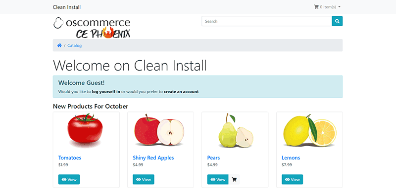
The difference in display is your own preference - whichever look you prefer - there are fans of both.
Note that if all Module Boxes have been removed, there are alternatives to the box modules that can be displayed elsewhere e.g. in the navigation bar or the footer but an alternative module for displaying Categories is not included with Phoenix.
Product Listing
From admin go to Configuration → Product Listing to see this:
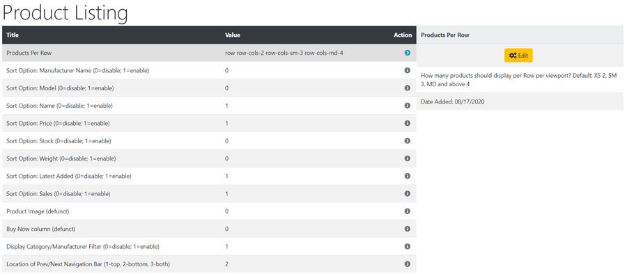
These are the settings for the display of products e.g. within a category.
So, again, CE Phoenix looks great as it is but you can change the defaults here.
If you do have a play, ensure you note the defaults so they can be changed back again. The values for the settings Products Per Row change how many products are shown per row across the screen width for different device screen sizes from tablets SM to desk top monitors XL
The values for Sort Option: enable/disable the menu items that show in the Sort By drop down menu shown on the webpage.
There is also an option to enable/disable the Display Category/Manufacturer Filter - note that Manufacturers could also be used as a secondary method of categorising products.
There is also an option for the Location of Prev/Next Navigation Bar 1-top, 2-bottom, 3-both - note 0 to disable.
Tip: This whole Sort By/Filter section can be disabled by entering the following in user.css
div.alert-filters { display: none !important; }
Product Images
From admin go to  Layout Modules → Product Info
Click on Gallery in the Modules list to edit.
If multiple images have been uploaded for a product, the way they are displayed on the product page can be changed.
As indicated in the Thumbnail Width module settings, the number of images per row can be changed by changing the numeric setting.
Many Addons and Extensions available in the CE Phoenix Cart Addons Library
If help is needed, support is available in the CE Phoenix Cart Support Forum
Phoenix Cart User Guide, like CE Phoenix Cart, is free to use but is maintained by unpaid volunteers.
All other content is the reserved Intellectual Property and Copyright of phoenixcart.org
